Insights from “Designing for Financial Services”
At Designer Fund, we are working to bring design to underserved industries like health care, energy, and education. These services are essential to our lives and design is what can make them usable and delightful. Financial services is particularly in need of design, especially as new technologies are reshaping the industry. And while terms like “compound interest” might not spark a lot of excitement among designers, there are significant opportunities for creativity, problem solving, and innovation in designing for financial technologies. We recently hosted a panel discussion with designers from Wealthfront, Earnest, and Gusto (formerly ZenPayroll) to explore the unique design insights that have helped each company succeed.

Design is key to making financial services smarter, more efficient, and easier to use
Design is crucial for all three companies, but it plays a different role in each. Earnest, a platform for customized, low-cost lending and loan refinancing, aims to leverage data and design to create a smarter alternative to traditional financial institutions. “You don’t feel like banks are on your side,” says Earnest’s data visualization lead Lian Chang, who has a background in architecture design and humanities research. “You feel like they want you to mess up so they can get the fee. We don’t see it that way.” Chang digs into Earnest’s unique dataset to find and tell stories about personal finance trends, and makes clients’ data visual to help them understand their options. “We can use data and design for a win-win situation,” Chang says.
Gusto provides payroll services for small businesses with the goal of making the process feel more human and emotional, more like a relationship. David Nguyen, head of design and user experience, explains that design reduces the cognitive load for small business owners who have countless other things to worry about. “You didn’t start a bakery to run payroll,” Nguyen says. The design challenge is twofold: not only simplifying information to help people effectively run payroll, but actually making it a process they enjoy—for example, sending a business owner a reminder to pick up cupcakes on an employee’s birthday.
Wealthfront is a platform for personal financial management that aims to automate traditional financial services, breaking down the barriers of Wall Street by using algorithms to provide new benefits and services. Mike Hu, Wealthfront’s lead product designer, had never been particularly interested in personal finance, but the possibilities of creating an alternative to Wall Street got him excited. In fact, his perspective is ideal for his job, because the design challenge is to make a lot of highly technical information relevant, personal, and yes, even exciting. “Design is education,” Hu says. “It’s about communication: How do we communicate the benefits of what Wealthfront does?” Too much information is a burden, so Hu is always thinking about how to provide only what’s most beneficial. But this is personal—clients are all at different stages of their lives, so what’s beneficial will differ for each of them. By understanding each customer, Wealthfront can tailor its product to individual clients, creating a personal and meaningful experience.
Insight 1: Help customers focus on the data that matters and nothing else
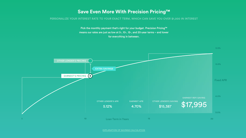
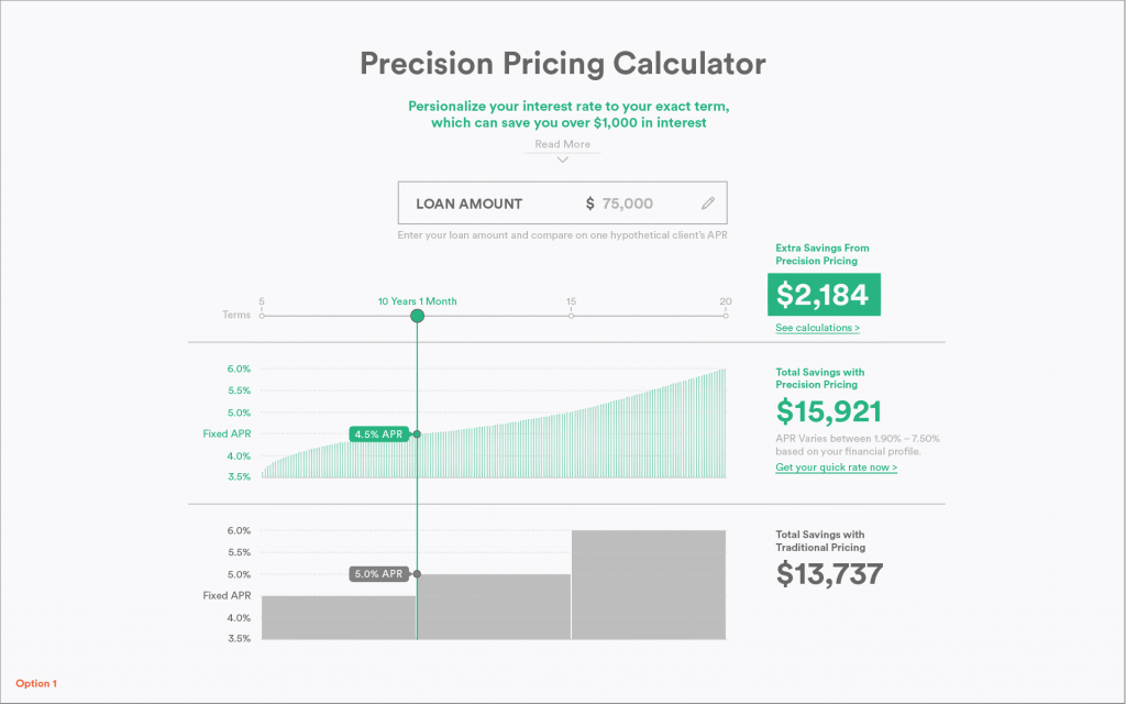
Chang shared Earnest’s design process for communicating a feature it calls Precision Pricing. Traditional banks offer loans with different interest rates for different term lengths—three, five, or seven years. But these are big jumps, and she explained that people end up either paying more than they can afford or paying less than they can, but spending too much on interest. Precision pricing lets Earnest’s clients pick the exact interest rate and loan length that’s right for them instead of jumping up or down to the next tier. Smart idea, right?
One of the first tests for communicating the concept of Precision Pricing. Ultimately it had too many numbers and graphs that people found confusing.
The challenge, however, was to figure out how to explain it in a way that was both simple and comprehensive, educating clients about a complex topic without overwhelming them with information. Over several iterations, designers tested different ways to present the data to clarify which numbers are most important. In the end, they collapsed a series of graphs into a single arc to convey only the most important information.

Communication for Earnest’s Precision Pricing – helping people understand the benefits of loans based on your monthly budget.
Insight 2: Use simple visual solutions to communicate complex concepts
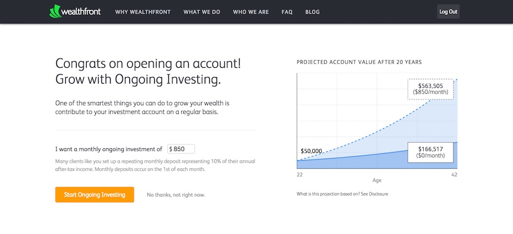
When communicating investment values at Wealthfront, the right visualization can dramatically improve a client’s understanding of long-term compounding effects. The benefit of helping clients make more from their investment is obvious, but the challenge was finding a clear, effective way to demonstrate that value and increase sign-ups. The information is intangible and very difficult to wrap your head around—it’s a matter of a fraction of a percent over 20 years. Visual design was key to Wealthfront’s ability to demonstrate abstract data. For example, showing how a repeating monthly deposit of 10% of post-tax income reaches a retirement goal in 20-30 years.

A simple graphic showing the huge difference when saving $850/month for 20 years vs no monthly savings.
Insight 3: Consider when to communicate to customers and test iterations for the best outcome
Along with refining the visual communication, Wealthfront’s designers had to pay careful attention to how and when the idea of recurring deposits is introduced. “We’re always watching how we’re impacting our clients as they engage in this conversation with us,” Hu says. They built several iterations, progressively clarifying key information and refining the tone of communication. They designed the flow to introduce recurring savings right after a client has entered their annual income, when the idea of regular deposits and long-term investment makes sense. Refining the visual communication and the timing of when the service is introduced resulted in a big increase in enrollment.
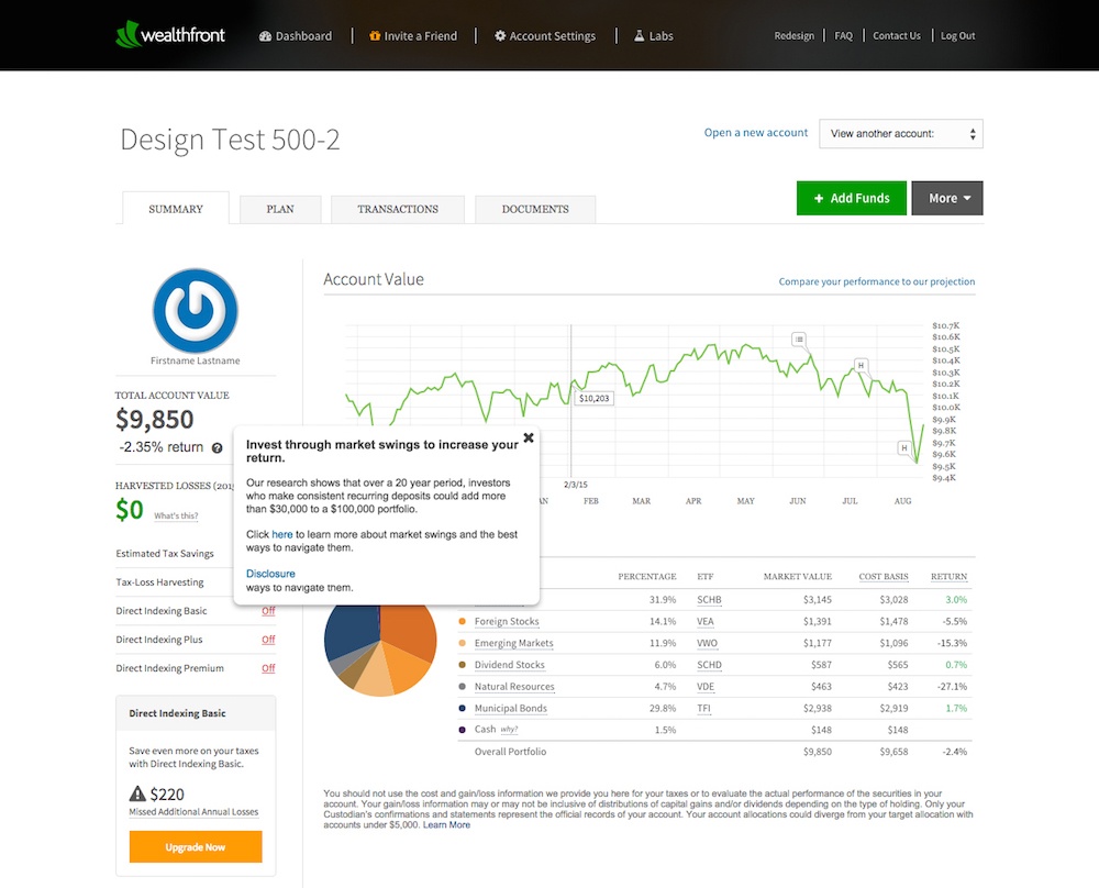
Additionally, Wealthfront found that people were often guided by emotion during market swings and took actions that were not in their long term best interest. To combat this they communicate this message directly on a person’s dashboard during market swings to help them make better informed decisions.

Wealthfront messaging to its customers the importance of investing through market swings.
Nguyen had a similar experience at Gusto with the timing of communication. Gusto recognized that onboarding is a pain point for both businesses and employees: it’s a cumbersome, impersonal process, and it involves sharing a lot of very personal information. What’s more, it typically involves someone in HR retyping paperwork into payroll software, which leads to lots of data-entry errors.
Gusto came up with a new employee onboarding process in which new hires enter their own information, which cuts down the workload for the business owners and HR staff and reduces mistakes. More importantly, it creates an opportunity to ask all those sensitive questions in a way that helps employees feel cared for and invested in the business. It’s a smart, simple solution, but they had one final problem: how to get people to adopt it? The designers realized that not only did they have to build an effective onboarding process but also make it easy to find and use. Once they made the self-onboarding flow easy to discover, use went up 1000% from their first iteration.

Gusto allows employers to have their employees enter their information to the payroll system – saving employers time and insuring fewer errors in their platform.
Taking familiar skills to new places
In the context of financial technologies, traditional visual elements like information hierarchy, color, and graphics become crucial in helping people and businesses control their financial situations. Even subtle decisions, such as the timing of communication, can have huge long-term impact as their benefit compounds over time. The panelists’ insights reflect how important design can be when dealing with money and provide a glimpse into the opportunities available to designers who decide to tackle underserved spaces.
If you’re interested in more insights about the latest design tools and methods, check out Bridge and keep in touch here.
